


 A college website has a difficult job.
It has to speak to prospective students, current students, parents, faculty, staff, alumni, and the community. It has to organize an almost overwhelming amount of information. It has to work beautifully on a phone, load quickly, perform well in search, and somehow make a person who has never set foot on campus think, “I can see myself here.”
That last part is where the real work begins.
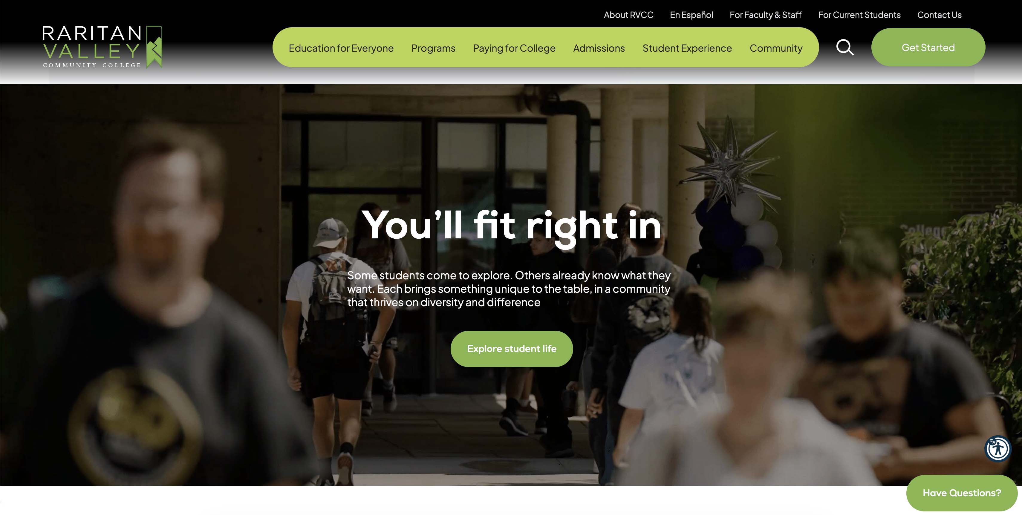
For more than a decade, our team has had the privilege of partnering with Raritan Valley Community College (RVCC), and we were honored to be chosen to bring their latest website redesign to life. The challenge went beyond giving their website a facelift. Eight years after its previous redesign, the college had evolved significantly, and its digital experience needed to evolve with it.
More importantly, the project also presented an opportunity to rethink something bigger: how RVCC talks to prospective students.
What followed was a shift in perspective. And that shift offers a few lessons every higher education marketing team should pay attention to.
The problem with “Our school is amazing”
Higher education has a messaging problem.
Spend enough time looking at college websites, and you'll start to notice a familiar pattern: “Your path to success.” “Your journey to the best you.”
The intention is positive. But there's an underlying assumption that can miss the mark.
Prospective students aren’t necessarily looking for a college to tell them they need to become their “best selves.” They’re looking for an education that builds on who they already are, and helps them get where they want to go.
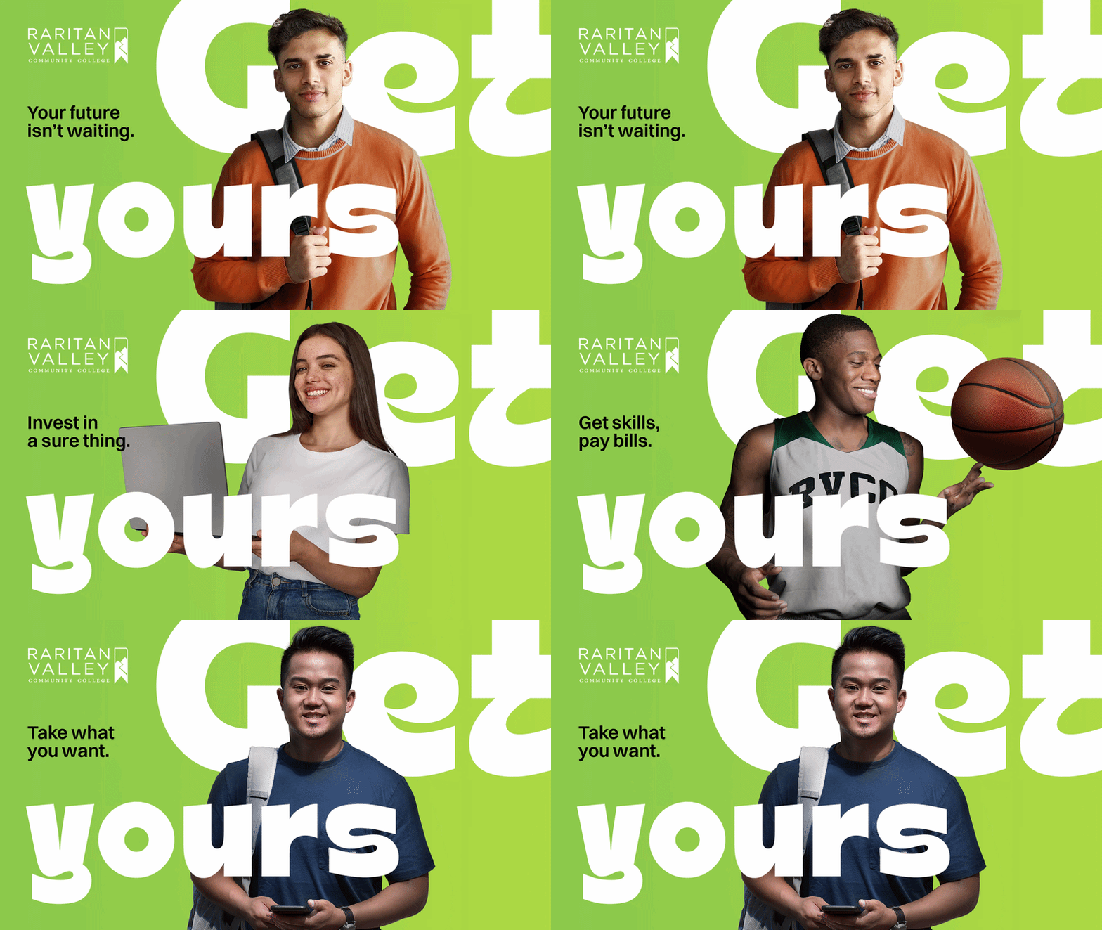
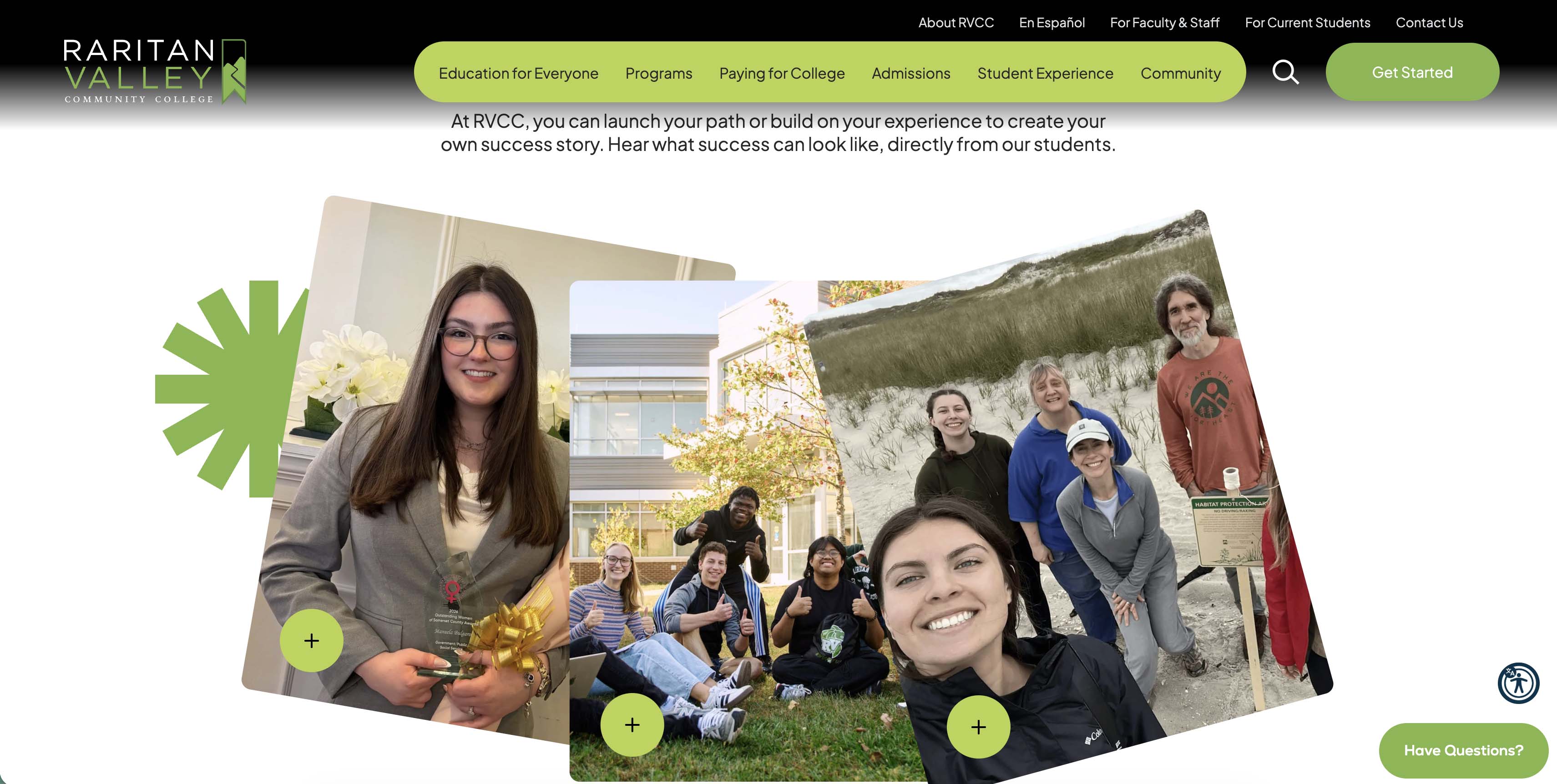
That's the thinking behind RVCC's “Got yours?” campaign. Instead of framing education as a transformation from an inadequate “before” to a better “after,” the campaign takes a more positive, human approach.
You already have something. What do you want to do with it?
This idea became a catalyst for the new RVCC website.
It’s a simple but effective lesson for higher ed marketers: stop making your institution the hero of every story. Make the student the hero.
A prospective student doesn't primarily want to know that your college is “amazing.” They want to know what your college can do for them. Can I find the program I'm looking for? Will this fit my life? Can I afford it? Will these classes help me get where I want to go? Can I picture myself here?
Those are the questions a good website should answer.
When 20,000 pages become a UX problem
The old RVCC website had accumulated more than 20,000 pages.
That's a lot of information, and information isn't automatically useful just because it exists.
Over the years, pages had accumulated in different places, without a consistent hierarchy. Old information lingered while new content was layered on top. Eventually, finding something could feel like an endless search through closets, drawers, and links.
The redesign became an opportunity to start over.
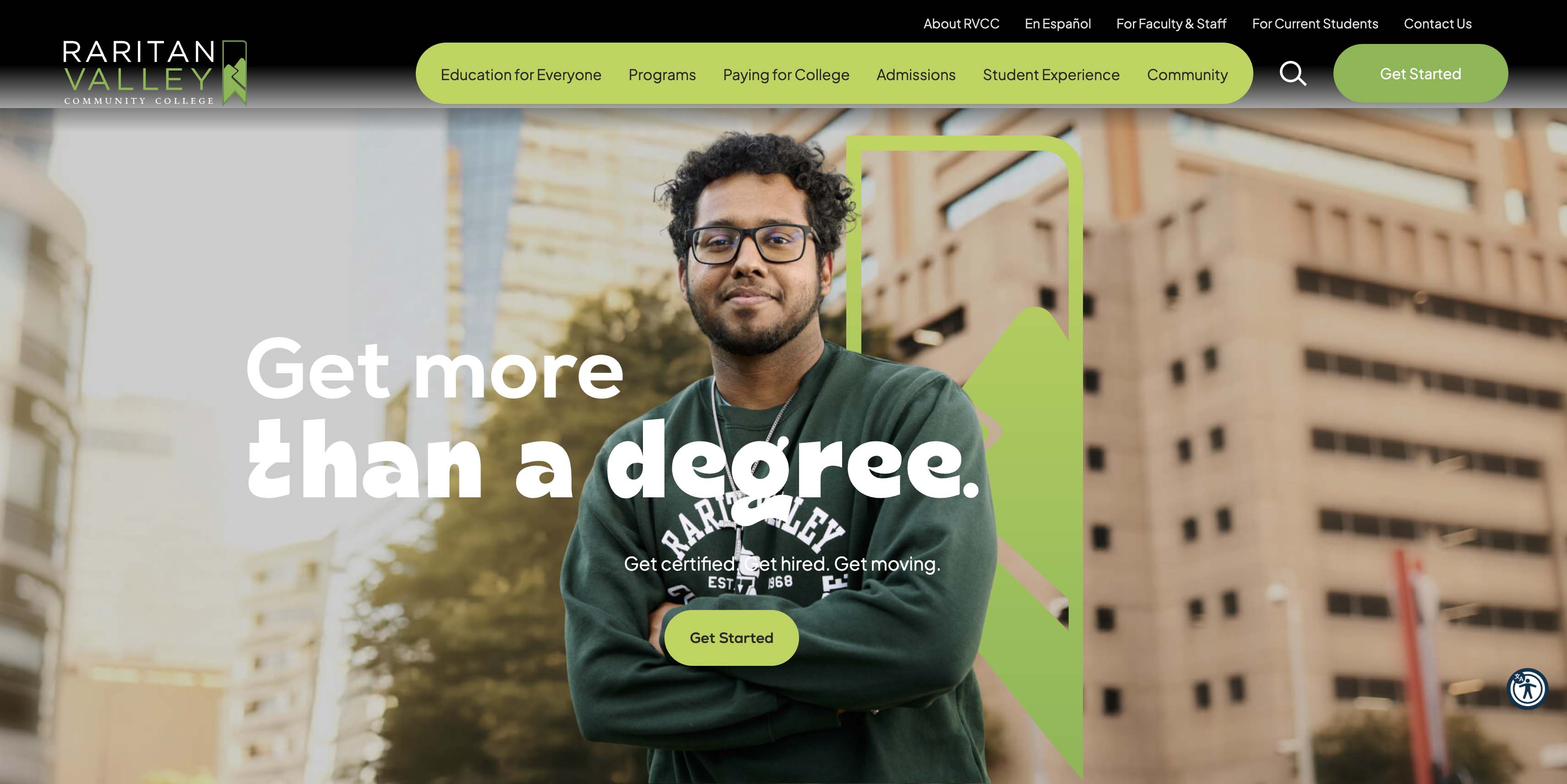
RVCC's team rolled up their sleeves alongside our team, consolidating content, removing what was no longer necessary, and creating a much clearer structure. We redesigned the navigation around how people actually look for information, not how the organization is divided internally.
That's a big takeaway in higher ed web design: your organizational chart is not your information architecture.
Departments may be important to the people who work in them. They're rarely the way prospective students evaluate their options.
Students search your website thinking: “I want to become a nurse” or “I need a better job”, or “can I take classes while I'm working?”.
A successful higher ed website translates institutional complexity into a language and structure that makes sense to the person on the other side of the screen.
Making “pathways” feel like real life
Taking a student-centered approach also influenced one of the website sections we're most proud of: Education for Everyone.
Higher education loves terminology that makes perfect sense internally but can feel abstract to future students. “Pathways.” “Workforce development.” “Student success initiatives.”
These phrases may be accurate, but accuracy isn’t the same as connection.
Workforce development, for example, can sound narrowly vocational. In reality, it can mean much more: learning a new trade, taking additional classes, developing a skill, changing careers, or simply leveling up professionally.
So instead of asking visitors to decode institutional language, the new RVCC site makes the possibilities more approachable.
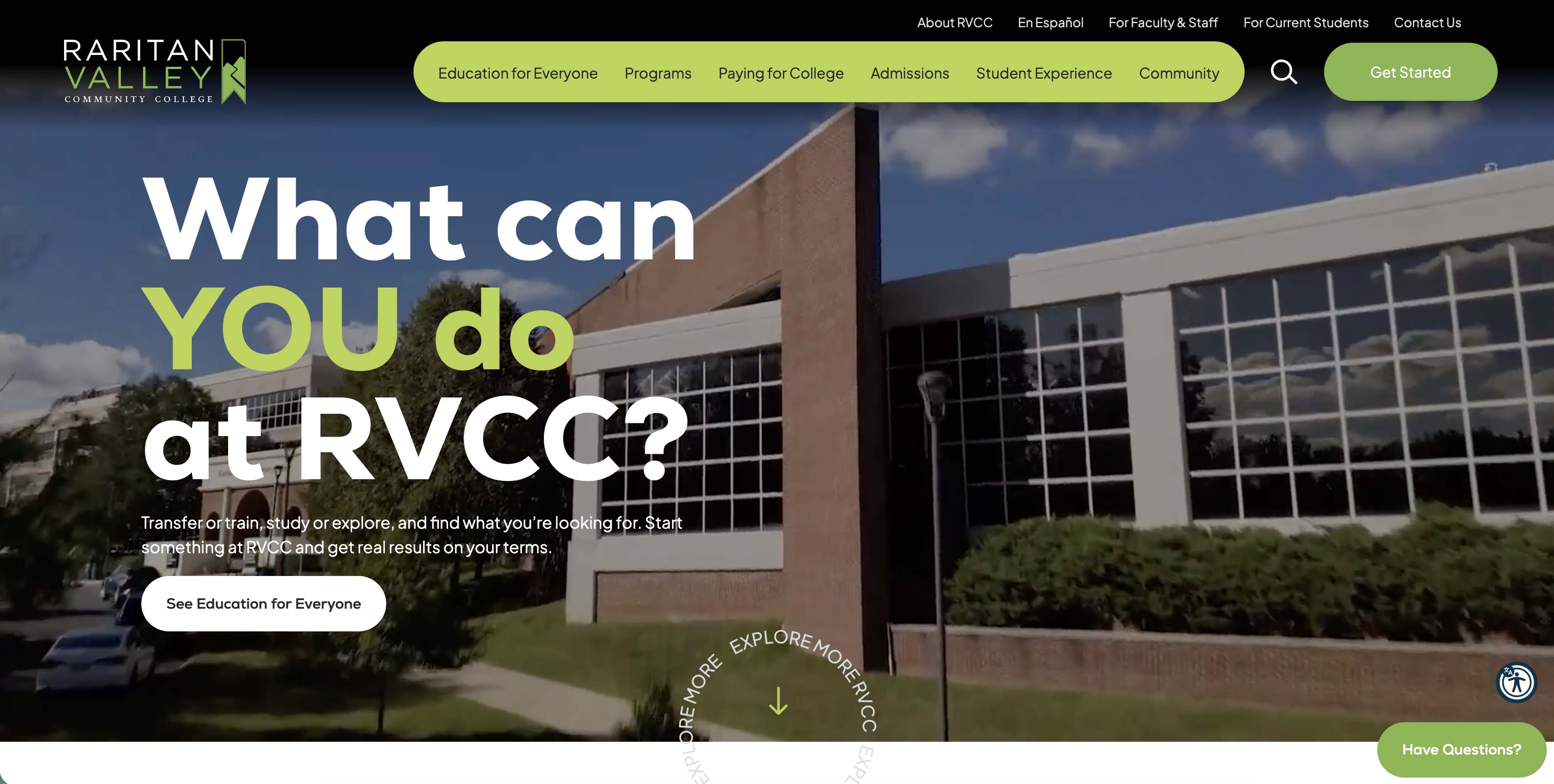
Education for Everyone gives prospective students a place to explore possibilities and, more importantly, recognize themselves in them.
That's another lesson worth stealing: if your audience doesn't use the language, don't make them learn it before they can understand your offering.
Good UX isn't just about where a button goes. It's about whether the words surrounding that button make sense to a real person.
Your homepage isn't the front door anymore
Another important shift is happening in higher education digital marketing: people don't necessarily enter your website through the homepage.
They Google something. They ask an AI tool. They click an ad. They share a program page. They follow a social post.
Prospective students may never see your carefully crafted homepage hero before landing directly on a program, admissions, financial aid, or continuing education page.
That changes the way institutions need to think about SEO and content.
Every important page should be an entry point. It needs enough context to make sense on its own, clear next steps, useful information, and language that matches what prospective students are actually searching for.
For RVCC, that meant educating teams across the college about how search works today, and challenging the assumption that the homepage needs to contain everything.
A great higher ed website isn’t a directory of everything the institution offers. It’s a guide that gets each visitor to the right information at the right moment.
Bringing the whole college along
Of course, redesigning a college website isn't just a design project.
It's a people project.
At a higher education institution, everyone has a reason their content matters. Departments want visibility. Faculty have information to share. Teams have spent years building pages. Everyone wants a place on the homepage.
That's completely understandable.
It's also exactly why major higher ed redesigns require more than a talented creative team.
For RVCC, we led four in-person content working sessions at the college. Staff and faculty participated in dedicated sessions where we explained the new goals, discussed how to write for the redesigned site, and—perhaps most importantly—explained why the changes mattered to users.
That's an often-overlooked part of digital transformation: you can't redesign the experience without helping the organization see it through the eyes of the people it serves.
We set the launch date at the beginning of the roughly 14-month project, and our team stayed committed to it. That discipline mattered. So did RVCC's willingness to trust the process.
The new website wasn't just something eDesign Interactive delivered to RVCC. It was a transformative digital experience both our teams built together.
Early results show real impact
The new site has only been live for about a month, but early performance data looks great.
Key events (ex: completing important actions) increased 30.7% after launch. Engaged sessions increased 24.26%, reaching 36,380 users, while the engagement rate rose 11.28% to 56.55%. Average session duration also increased by 17.33%.
For us, the most meaningful number is the increase in key events.
Traffic is nice. More visitors can look impressive in a dashboard. But what really matters is whether visitors are taking the next step once they arrive.
Are they finding what they need? Are they engaging with the content? Are they filling in an online application?
That's the difference between designing a website that looks good and designing a digital experience that works.
That's why measurement shouldn't happen after launch. Analytics should inform the work from the beginning and continue shaping it after the site goes live.
The bigger lesson for higher education
The RVCC website redesign is a good reminder that higher education websites are ultimately about people. They’re about understanding what prospective students need, helping them see themselves at the institution, and taking the next step with confidence.
A prospective student arrives with a question, a goal, a worry, or a possibility. Your digital experience has a few seconds to demonstrate that you understand what they're looking for.
That means clearer language. Better information architecture. More useful content. Stronger search visibility. More authentic storytelling. And a willingness to stop talking about the institution long enough to listen to the person you're trying to reach.
RVCC embraced that shift.
The result is a vibrant new website designed to inform, connect, and grow alongside the college. It feels modern and engaging, but the visual transformation is only part of the story. The more fundamental change is how the college communicates, putting the people it hopes to serve at the center of the experience.
And that's where great higher ed marketing starts.
At eDesign Interactive, we've had the privilege of working with RVCC for more than a decade across website design, content marketing, and digital campaigns. We've seen firsthand what can happen when an institution is willing to rethink not only how it looks online, but how it talks to the people it wants to reach.
If your college website has accumulated years of content, your navigation has become difficult to manage, or your marketing is talking more at prospective students than with them, it may be time for a reset.