The brutal truth nobody's telling you about the next era of web design.
Here's what keeps CMOs awake: their competitors are rebuilding websites that convert at 4x their current rate, load in under a second, and turn casual browsers into committed customers before the homepage finishes loading.
The gap between winning and losing online has never been wider or more measurable. And it has nothing to do with the trends you're reading about in design blogs.
The 50-Millisecond Moment That Decides Everything
Your website has exactly 0.05 seconds to make an impression. Not half a second. Five hundredths of one second.
That's faster than a blink. Faster than conscious thought. It's a gut reaction, and 94% of those reactions are triggered purely by design.
But here's the twist: the best-performing sites in 2026 aren't trying to impress visitors. They're trying to eliminate doubt.
Think about the last time you landed on a website and immediately felt something was off. Maybe the navigation confused you. Maybe the visuals screamed "2019." Maybe it just felt cheap. You probably left within seconds, even if you couldn't articulate why.
That's what 75% of people do when judging your company's credibility: they look at your website and make a snap decision about whether you're legitimate.
The sites winning right now understand this isn't about being pretty. It's about being instantly trustworthy. Clean layouts that guide the eye. Navigation so intuitive it feels invisible. Visual hierarchy that makes the next step obvious before you even think about it.
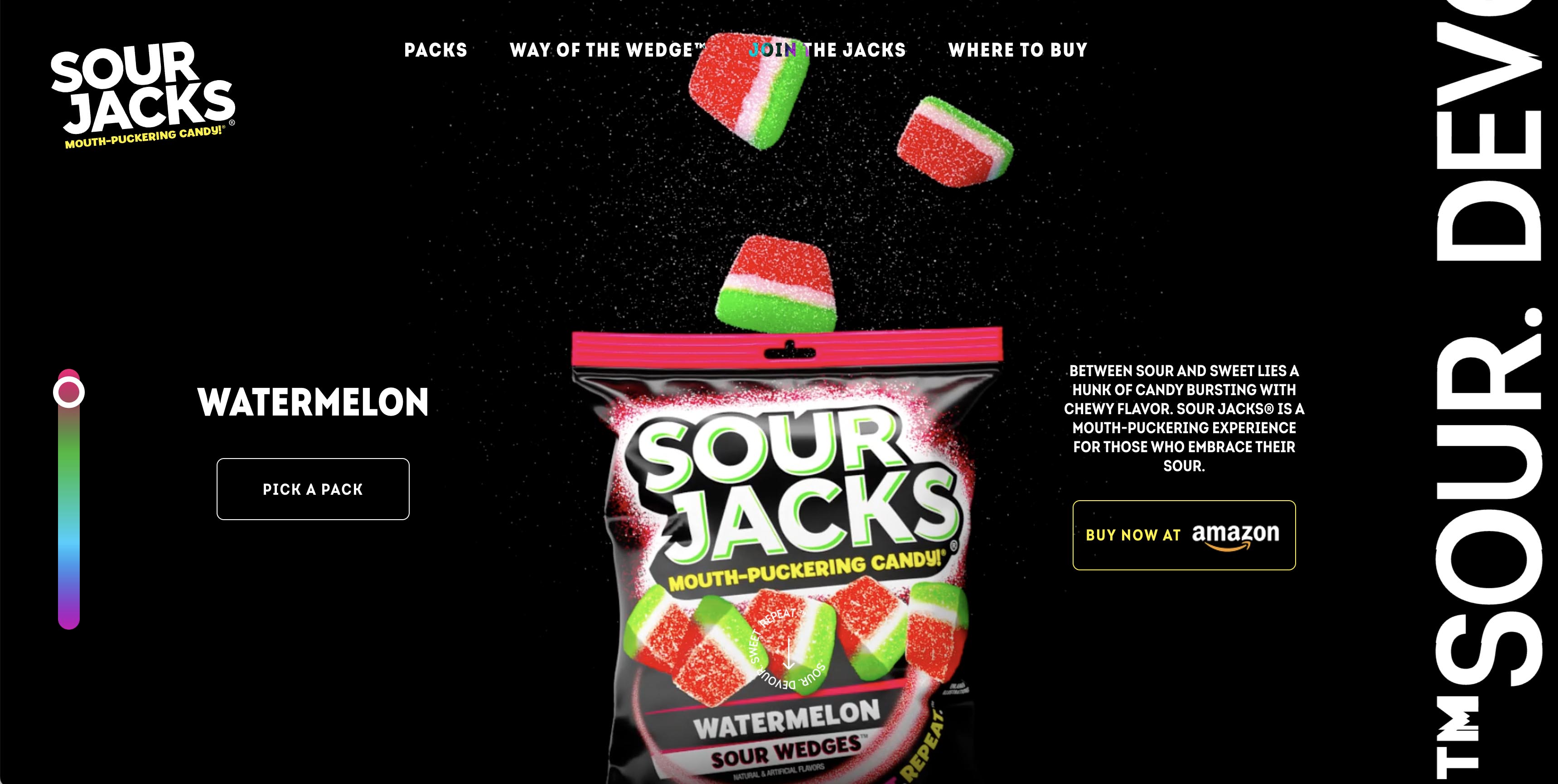
Take our work with Sour Jacks®. We didn't just make the experience colorful. We designed a mouth-puckering, sweet-and-sour thrill ride, with sensory visuals that match their brand promise. Because when candy is your product, your website better deliver joy in milliseconds.
Why Your Slow Site Is Bleeding Money
Let's do some uncomfortable math.
If your site takes one extra second to load, you lose 7% of conversions. One second. Not five, not ten. One.
If you're doing $5 million in online revenue, that one-second delay just costs you $350,000 annually. For doing... nothing. Just being slow.
And if you think desktop is your problem, mobile is worse: 53% of users abandon pages that take more than three seconds to load. More than half of your potential customers never see your pitch.
Speed isn't a technical nicety. It's a revenue lever.
The highest-performing sites treat milliseconds like currency. They obsess over above-the-fold optimization. They ruthlessly eliminate render-blocking scripts. They pre-load critical assets before users even know they need them.
This isn't about being "fast enough." It's about being so fast that speed becomes invisible – and friction disappears.
The UX Trap: Looking Good vs. Making Money
Here's where most redesigns go wrong: they focus on how the site looks instead of how it converts. Beautiful layouts that guide visitors nowhere. Stunning animations that distract from the call-to-action. Artistic expression that confuses the user journey.
The data is stark: proper UX design can increase conversions by up to 400%. But that only happens when every single interaction is designed with intention. Every button placement is thought out. Every form field is simplified to just one click. Every micro-interaction counts.
The question isn't "Does this look good?", it's "Does this remove uncertainty and make the next step feel inevitable?"
High-performing UX is nearly invisible. Users don't notice it – they just flow through your site effortlessly, completing actions almost without thinking. No friction. No confusion. No abandoned carts because the checkout process felt like solving a puzzle.
When we say "conversion-first architecture," we mean that every design decision is tested against one question: Does this make it easier or harder for users to do what we want them to do?
The Consistency Killer
You've got the design right. Your site loads instantly. The UX is frictionless.
Then a user clicks on a different section, and it feels like they've landed on a completely different website.
32% of customers will walk away from a brand after just a few inconsistent digital experiences. Not bad experiences – inconsistent ones.
Your brand isn't just your logo and color palette. It's how your navigation behaves, how your animations feel, how your content reads. Whether the experience on page 5 matches the promise you made on page one.
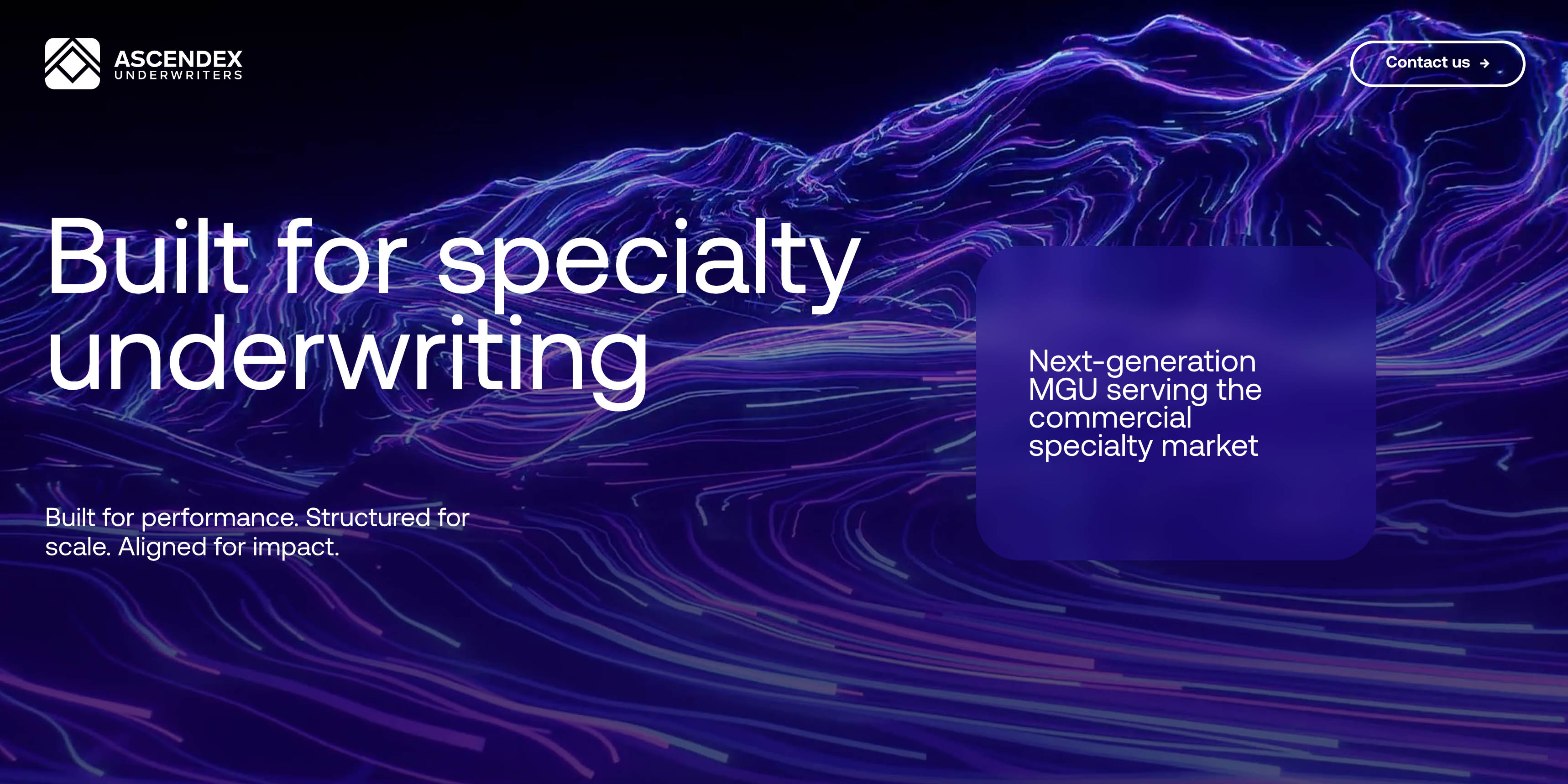
Look at our Ascendex landing page: we had two weeks to build something that functioned as a conversion engine. We didn't just match their visual brand; we matched their pace, their tone, and their interaction patterns. Every click reinforced who they are.
Because here's the reality: inconsistency creates cognitive load. It forces users to re-evaluate whether they're in the right place, whether you're legitimate, and whether they can trust you. Every inconsistency is a micro-moment of doubt.
And doubt kills conversions.
What This Actually Means for Your Business
If you're planning a redesign for 2026, stop thinking about websites as digital brochures.
Your site is a revenue engine. Every millisecond matters. Every click either builds trust or erodes it. Every interaction either guides toward conversion or creates friction.
The companies dominating their markets right now aren't winning because they have the trendiest designs. They're winning because they've built websites that:
● Establish trust before conscious thought kicks in (0.05-second first impressions)
● Treat speed as a conversion multiplier (every second counts)
● Guide users to action through intentional UX (400% conversion increases are possible)
● Maintain brand coherence at every touchpoint (consistency = trust = revenue)
This isn't about following trends. It's about building websites that work like well-oiled machines – beautiful, fast, intuitive, and focused on business outcomes.
The question is: which side of that gap will your website be on?
Need a website redesign or a digital campaign to increase sales? Our team is here to help! Contact us at info@edesign.bg.