There's a misconception that follows lactose-free products. Consumers browse the dairy aisle, spot the words "lactose free," and often assume they're looking at a plant-based alternative — oat, almond, cashew, or something else entirely.
For Green Valley Lactose Free, a brand built on real cows, real milk, and real craftsmanship, this misconception was frustrating. It stood between their exceptional products and the people who would love them.
That challenge became the beating heart of their brand-new website — and the result is something worth talking about.
A Website That Speaks Before You Read a Word
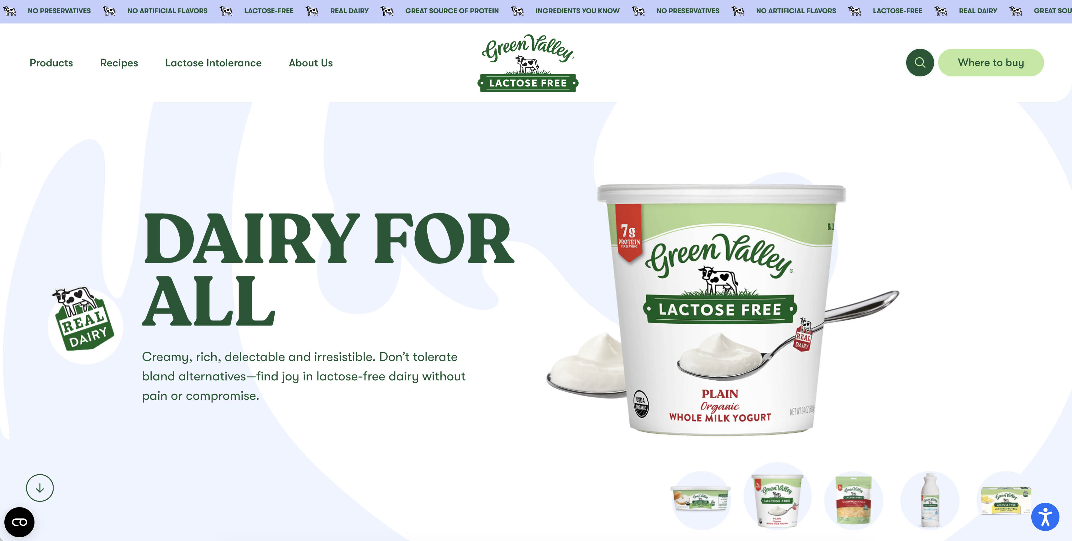
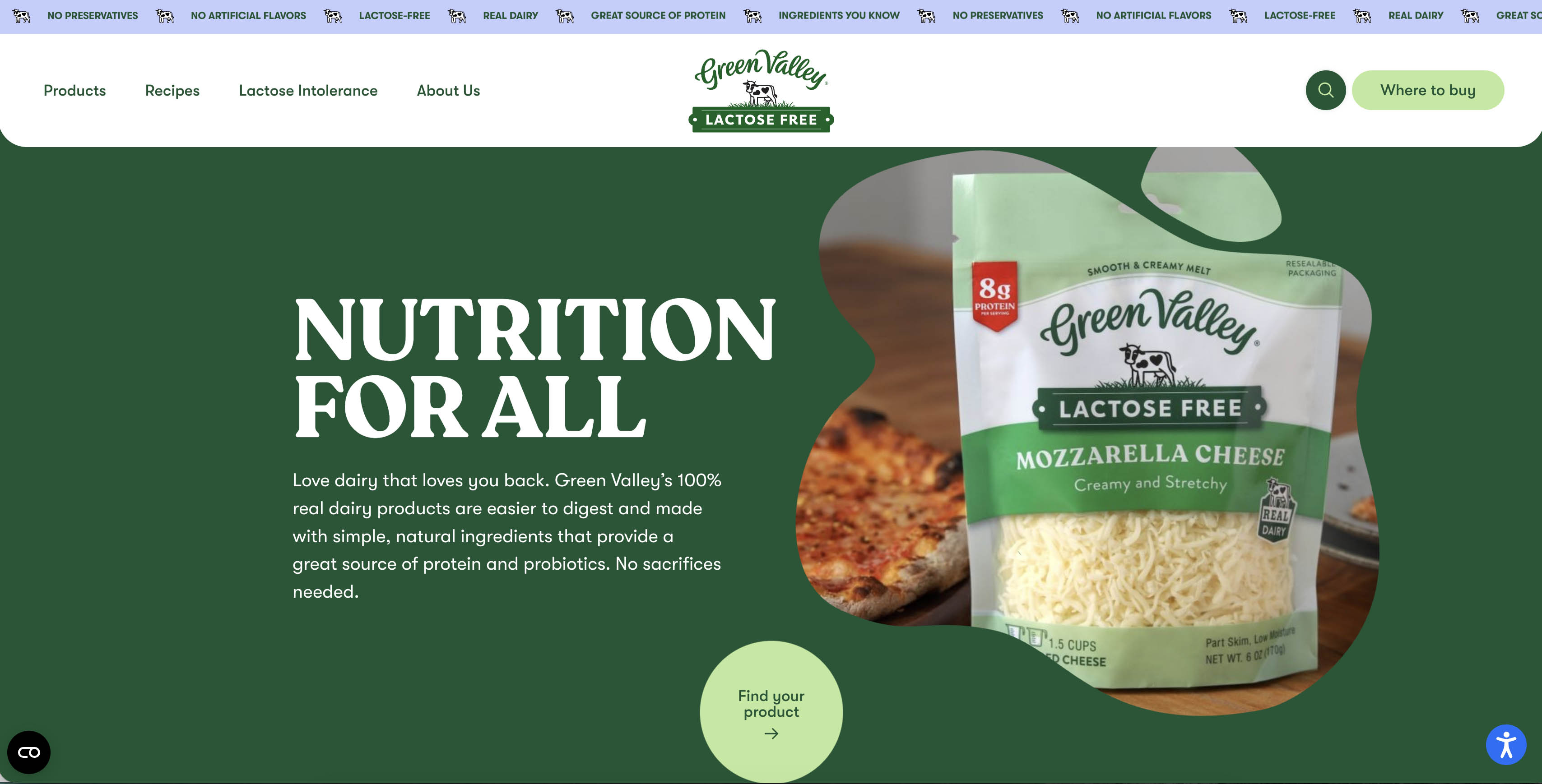
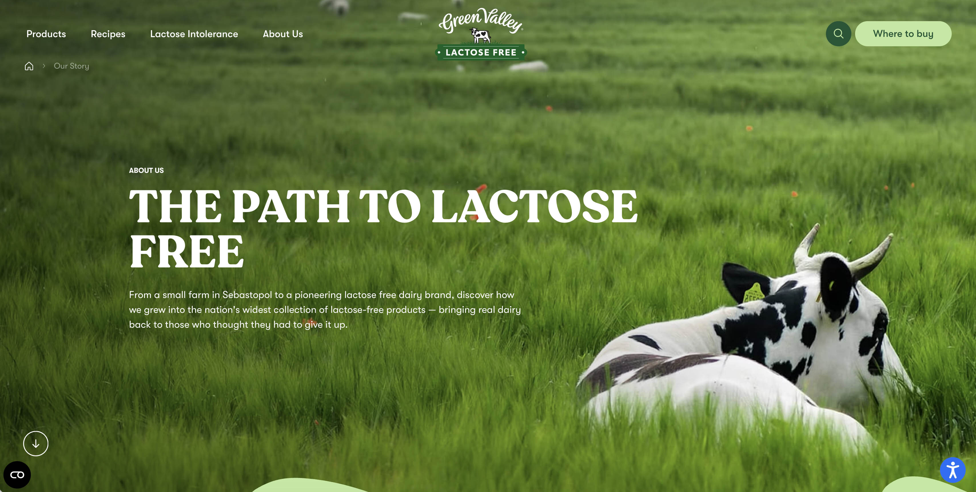
The moment you land on greenvalleylactosefree.com, something happens that most websites fail to achieve: the design communicates the brand's story instantly.
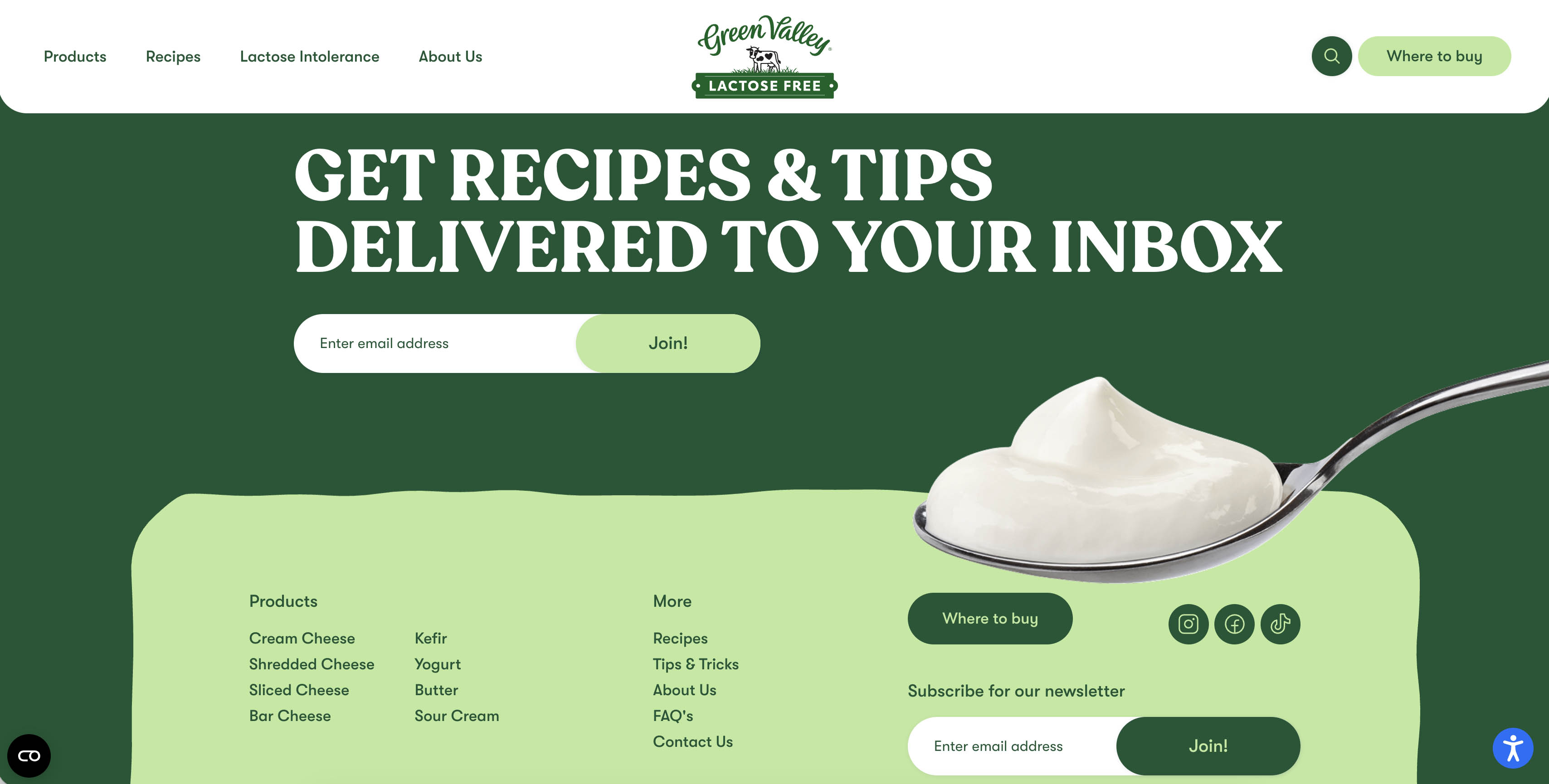
Creamy white backgrounds wash across the screen in a way that feels unmistakably dairy.
Subtle, flowing shapes —reminiscent of milk swirling into a glass — drift behind each product with elegance. It's a subconscious cue, but a powerful one. You don't need to read a headline to understand that this is a brand rooted in real milk.
The color palette is clean and intentional. White dominates as a visual argument: this is a milk-based brand, and the design doesn’t let you forget it. Soft color accents rise and recede like gentle waves, adding warmth without ever feeling cluttered. The overall effect is modern and elegant.
By the time visitors read about Green Valley’s commitment to real dairy, no preservatives, no artificial flavors, and no compromise on quality, the design has already made that case visually.
And then there's a cute little cow.
Green Valley's tiny, charming mascot — a nod to the real cows the company raises — appears throughout the site with a personality that's playful and earnest. It's the kind of detail that makes a brand feel human. It tells visitors: we know where our milk comes from, and we're proud of it.
The website articulates the brand's key pillars — lactose-free, genuinely dairy, a great source of protein, and simple ingredients — in a way that feels informative rather than defensive. It doesn't shout. It simply shows.
Packed with Content, Easy to Navigate
The website is both visually appealing and highly functional.
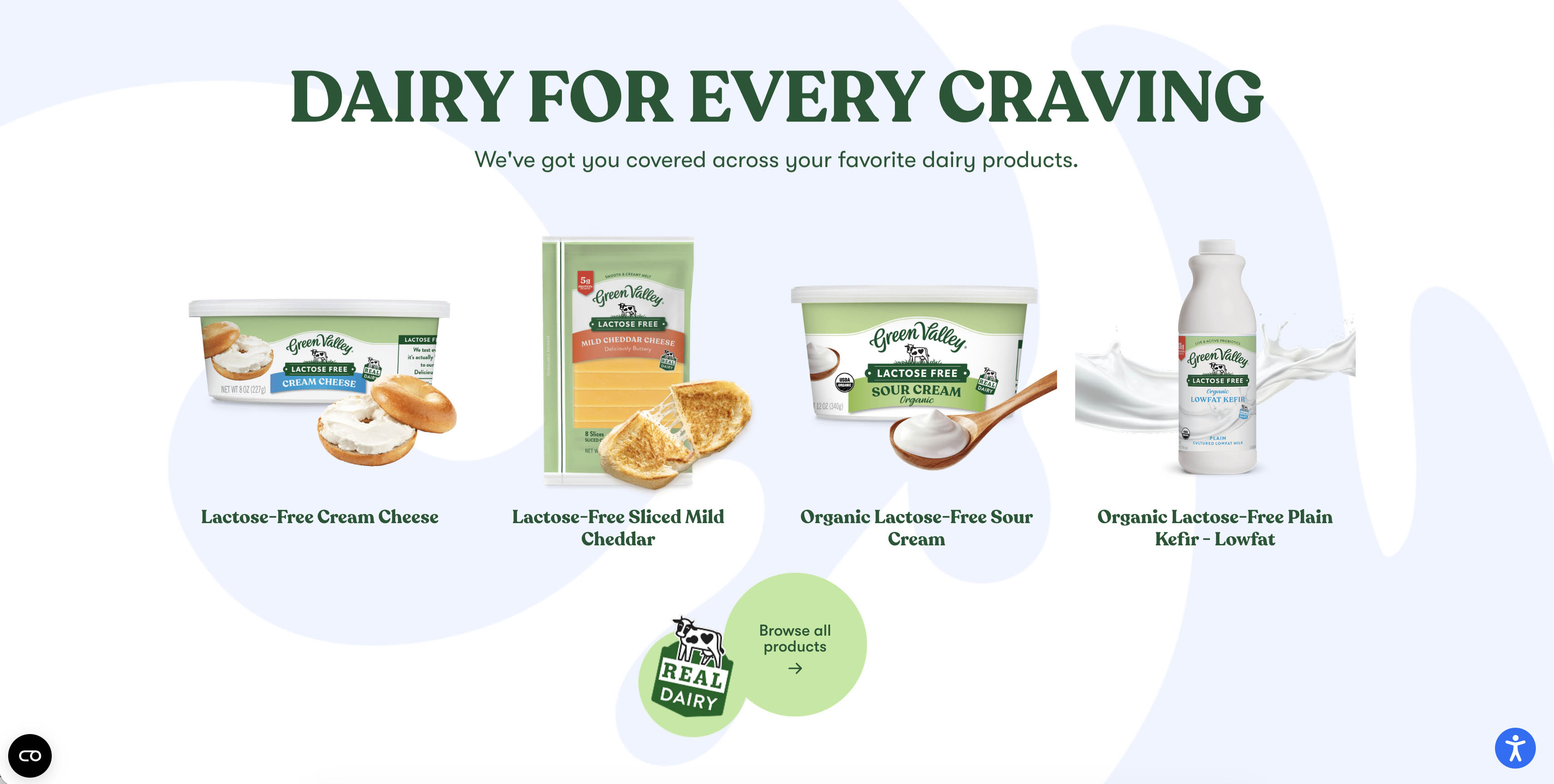
Each product—from cream cheese and kefir to shredded cheese, yogurt, and butter—has its own dedicated page with clear ingredient lists, certifications, and nutritional information presented in plain language. Health-conscious shoppers can make confident decisions without digging through fine print.
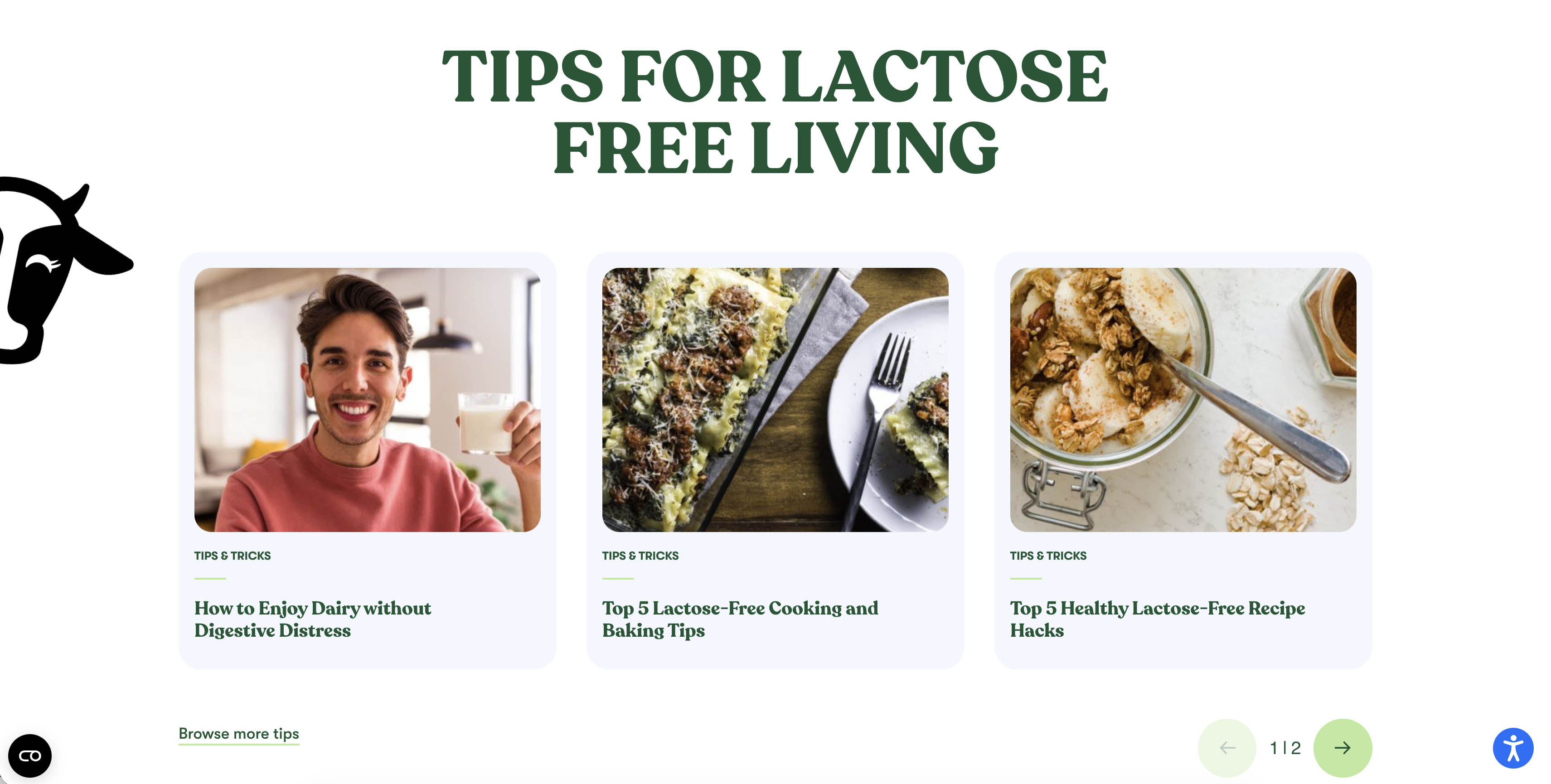
Beyond the products themselves, the site is a genuine resource. Recipes tied to specific products help visitors imagine Green Valley in their own kitchens, while a tips-and-tricks section blends helpful health information with a light, approachable tone.
Visitors can easily explore health tips, company history, corporate news, and FAQs, all supported by smooth animations and interactive features. The search bar and store locator make it simple to find products or information.
Smart Decisions Behind the Scenes
Green Valley came to our team with a real-world constraint: a defined budget and a tight timeline. The development approach honored that reality without sacrificing ambition.
A significant portion of the existing back-end CMS was preserved and modernized, freeing up hours to focus where it matters most — design, animations, and front-end interactivity. The result is a site that feels entirely new because the investment was placed exactly where users would feel it.
This kind of strategic thinking separates good web projects from great ones and a web agency that cares about its clients and wants to provide the best for their budget. Working within constraints doesn't have to mean working below your potential.
This kind of strategic thinking is what separates good web projects from great ones and defines a web agency that truly values its clients and delivers the best results within their budget.
Working within constraints doesn’t mean working below your potential — it just means making smarter decisions.
The Impact So Far
What makes this web design truly unique is how it blends storytelling, brand identity, and user experience into a cohesive digital journey. The combination of modern aesthetics, interactive elements, and subtle visual cues creates a site that educates, engages, and delights visitors with every click.
Since launch, the new Green Valley website has already made a measurable impact. Visitors instantly understand that “lactose-free” doesn’t mean “milk-free,” and the site’s SEO and Google indexation continue to grow, increasing visibility and brand awareness.
With this redesign, the joy, quality, and health-conscious values of Green Valley have been translated into an online experience that feels fresh, approachable, and memorable.
Whether visitors are browsing recipes, exploring products, or learning about the company’s history, the new website invites you to enjoy the creamy, real-dairy goodness that Green Valley has always delivered.
Ready to transform your brand or website?
Let’s start the conversation.
Tell us about your project →