The German marketing powerhouse has a new website design
Die Crew is a well-known marketing house in Germany. With many years in business, the agency supports some of the biggest names on the German market. Die Crew offers business consulting, brand development, campaign planning, creation and implementation.

Graphic Design, Creative Direction, Animation, User Interface Design, Project Management, Front-end Development, Back-end Development.
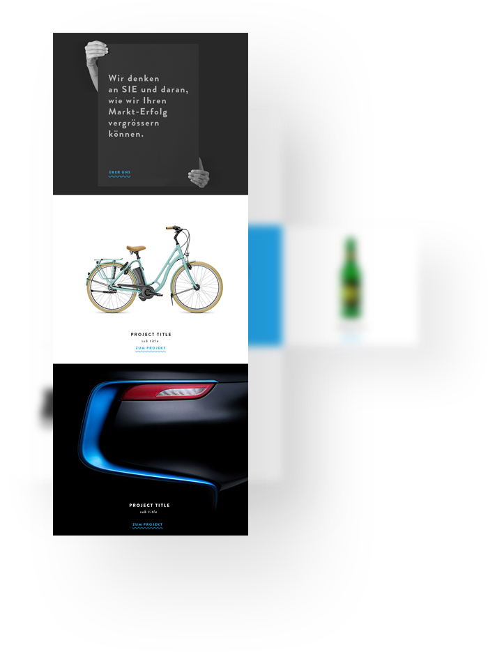
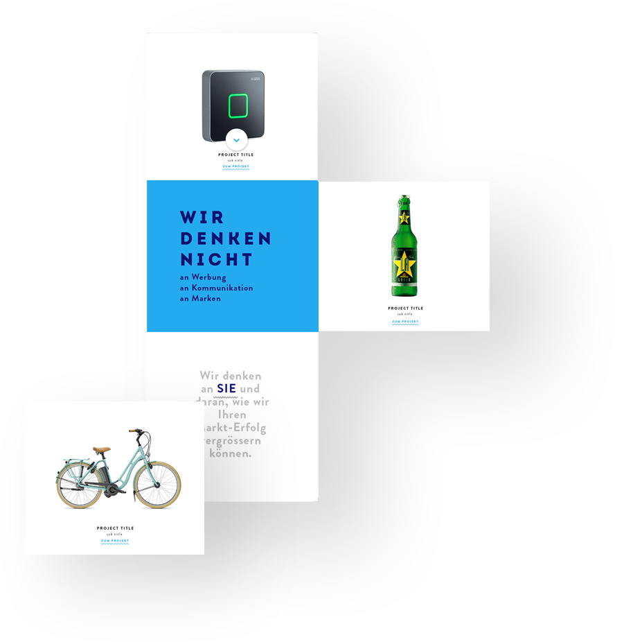
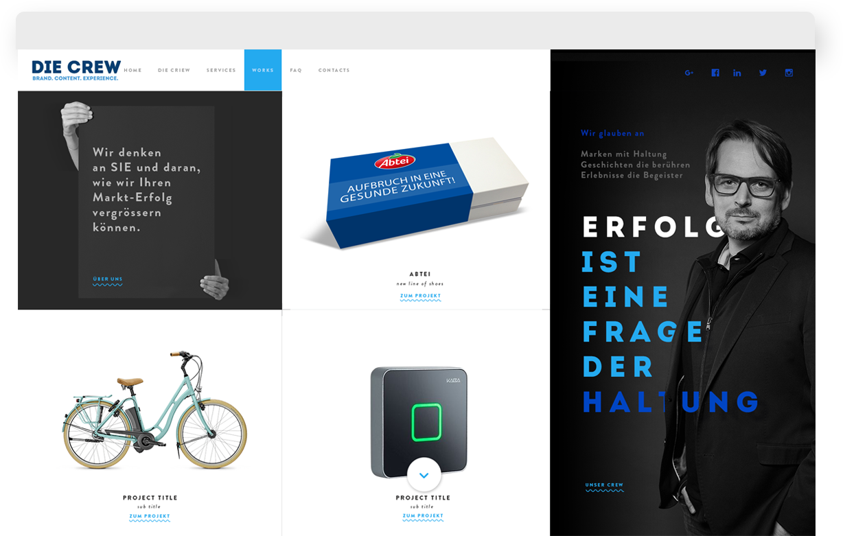
Flickering boxes, changing colors, invisible cool beat. Ladies and Gentlemen, let us introduce you to DieCrew.com! A strong and bold design for a strong and talented agency. We chose a card layout for a simple reason- not a single project of Die Crew resembles the next. The agency works with complex, colorful and unique brands. This is why we have featured each page, each project, and each client in its own separate world.
We’ve designed units of information totally unrelated and visually separate from one-another. Each “box” leads you to a different part of the website and opens up a brand new story. Yet the whole design is harmonious and blends well together. Like Die Crew’s agency, the website offers multiple flavors and many skills under the same roof of ingenuity, business balance and beauty.
The research phase of every project is always extremely important as it lays down the foundation for a solid UX approach.
Die Crew’s team requested freedom. The freedom to create pages, blog posts and case studies. They wanted the absolute flexibility to build every future page of their website as a unique design without using outside help. Our mission: “code endless possibilities in order to generate unique concepts at a touch of a button, with zero coding experience”. Sounds impossible?! Just keep reading!
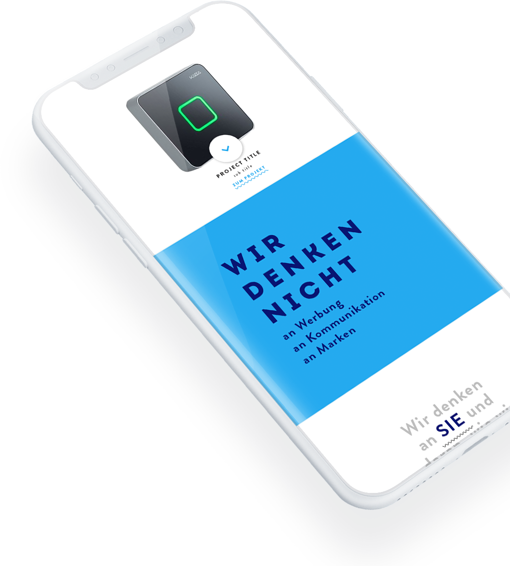
Die Crew does not have in-house developers, yet they wanted the ability to create content by themselves without being limited to a particular design. The answer? Create a boutique site builder inside the administration panel of Die Crew’s site that is flexible, intuitive and easy to use. We rolled our sleeves and spent several months coding a colossal project. Our efforts paid off. Each case study Die Crew designs is a site by itself. Uniqu designs, color palettes, look and feel. Each new page is also automatically generated to be mobile responsive without technical knowledge from Die Crew’s team.
If your website is not mobile responsive, you are missing out on huge opportunities online. Being “mobile” is not just a function of users’ screen and resolution- it’s also the fact that people are on the go. Die Crew was a (very!) difficult project from a coding perspective. Yet the site looks flawless on any mobile device. We’re so proud of our back-end programmers, they make magic happen.
More
projects
We use the power of digital technology to engage your audience...