

Modernize website to reflect leadership, philosophy, and scale. Elevated brand identity. Design around narrative, emotion, and strategic storytelling. Produce original photography and video. Rebuilt information architecture. Optimism, confidence, and distinction. WCAG 2.2 Level A standards.
Great design begins with listening.
In early conversations, Bon Appétit’s CEO shared the story behind the company’s ethos: zero-waste initiatives, deep partnerships with local farmers, scratch cooking at scale, and a willingness to walk away from lucrative contracts rather than compromise standards.
For Bon Appétit, food is not transactional. It is community, care, and responsibility. Meals deserve time. Ingredients deserve integrity. People deserve better.
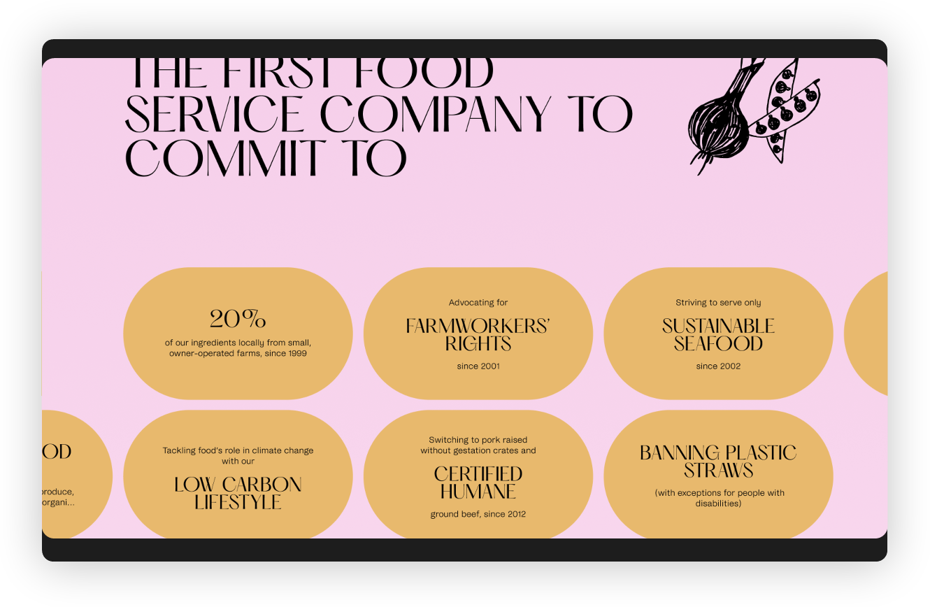
This philosophy isn’t marketing language, it’s operational truth. From reducing antibiotic use and advancing humane treatment standards to addressing climate impact and eliminating waste, Bon Appétit builds programs that influence industry policy, not just café menus.
This website redesign was as much about modernizing a website as it was about translating belief and passion into digital form.
Bon Appétit Management Company came to us with a website that had faithfully served them for two decades. Though incrementally updated, it no longer reflected who they had become: an industry leader redefining food service through sustainability, culinary integrity, and scale.
Today, Bon Appétit operates more than 1,000 cafés across 33 states, partnering with some of the most influential corporate, academic, and cultural institutions.
Their digital presence needed to match that stature.
Our mission was to elevate the brand’s online experience to reflect its leadership without losing the humanity and conviction that define it. Simple in theory. Complex in execution.
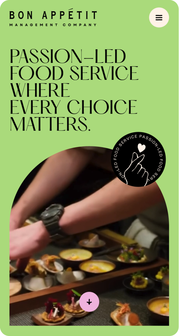
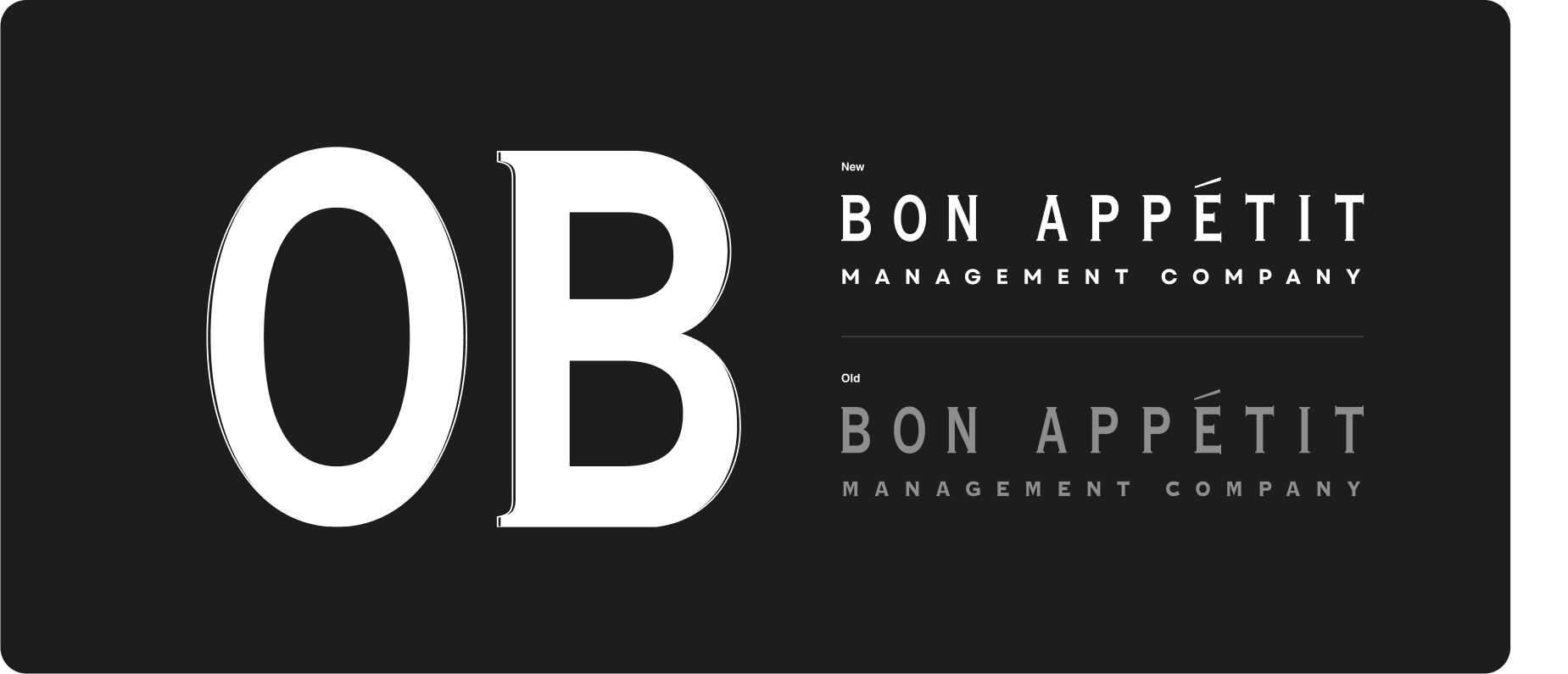
The supporting “Management Company” typography was updated to a cleaner, more contemporary typeface— more readable, more confident.
The changes are subtle in isolation, yet transformative in perception. This was brand stewardship at its most disciplined: honoring legacy while preparing for longevity.
Great design does not start in Figma. It begins in narrative.
We developed a detailed storyboard to map the site’s emotional journey. What should visitors feel first—authority? warmth? scale? humanity? The answer was all of the above, delivered in deliberate sequence.
The storyboard clarified hierarchy, aligned content priorities, and ensured every page served a strategic purpose. Through iterative feedback cycles, we built a comprehensive wireframe system that structured information around user flow and audience segmentation.
Bon Appétit shared visual references that were expressive and pleasantly surprising for the industry. We translated those inputs into a cohesive mood board, balancing vibrancy with credibility.
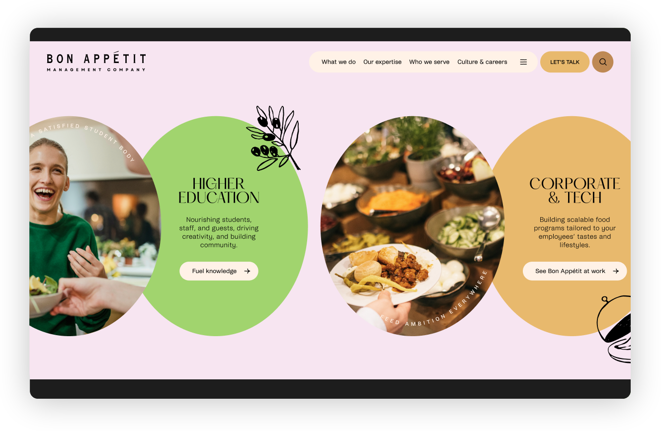
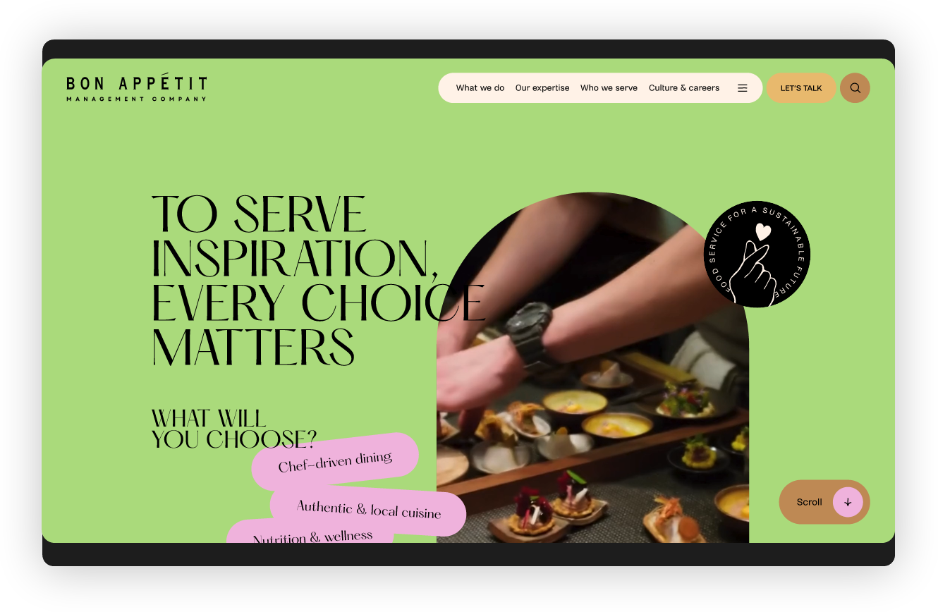
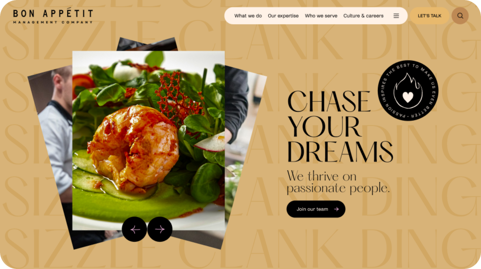
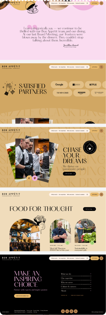
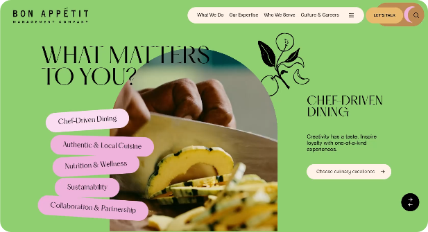
The resulting visual direction was bold: brighter colors, layered compositions, editorial energy. In an industry that often defaults to corporate neutrality, this was a conscious decision to lead, not blend in.
Vibrancy communicates vitality.
Color signals confidence.
Leaders don’t fade into the background.
This is where true collaboration matters most. Through open dialogue, we landed on a visual language that feels unmistakably Bon Appétit: optimistic, contemporary, and unapologetically original.
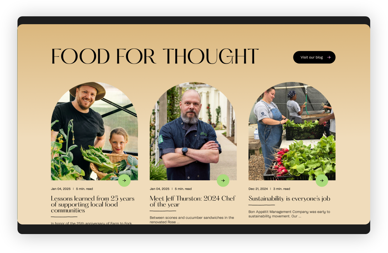
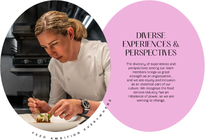
Together with Bon Appétit, we opted for absolute authenticity. Not a single stock image appears on the website.
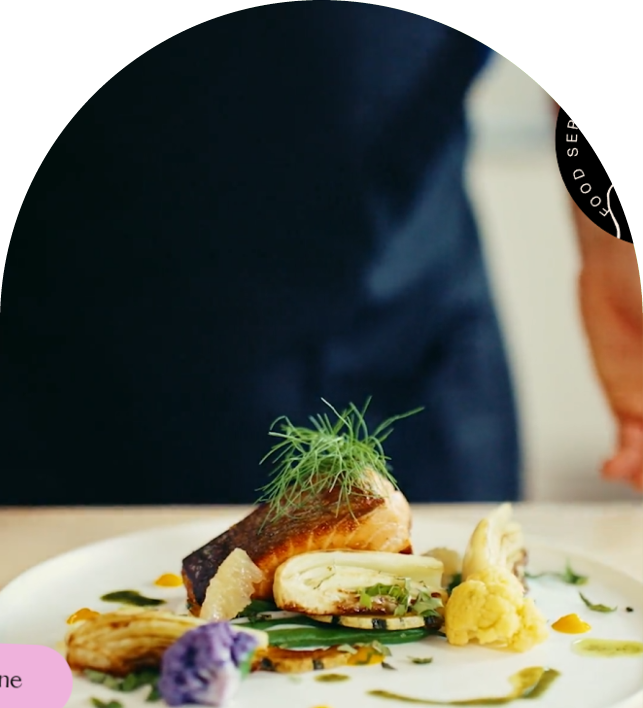
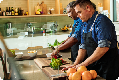
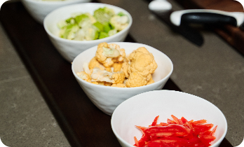
We led a dedicated photo and video production in Philadelphia, PA, capturing Bon Appétit in action on a college campus. Our team coordinated logistics, scoped storytelling moments, and documented real kitchens, real chefs, real guests. Bon Appétit also opened its extensive archive, allowing us to curate genuine moments from across its locations nationwide.
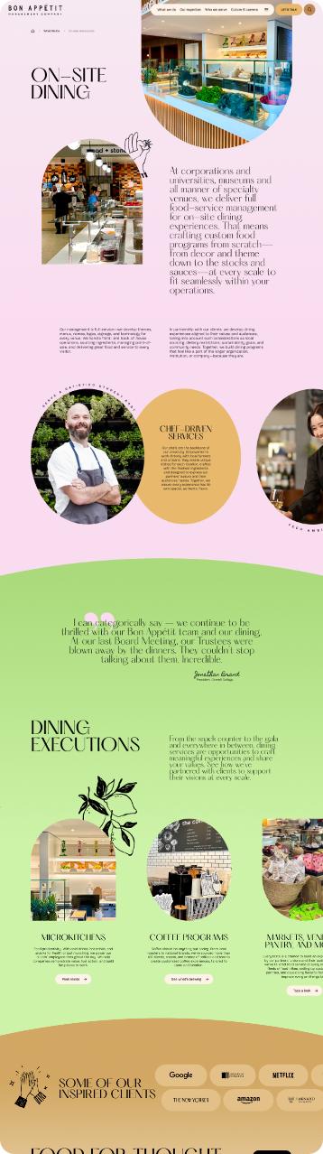
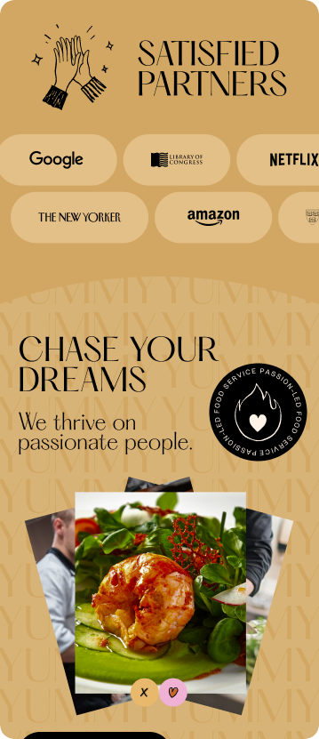
You can feel the difference. Steam rising from scratch-made dishes. Students gathering over sushi. Corporate teams connecting in thoughtfully designed spaces. These are not staged stock scenarios. They are lived experiences. No matter how elegant the UX, generic visuals dilute credibility. Authentic content multiplies it.
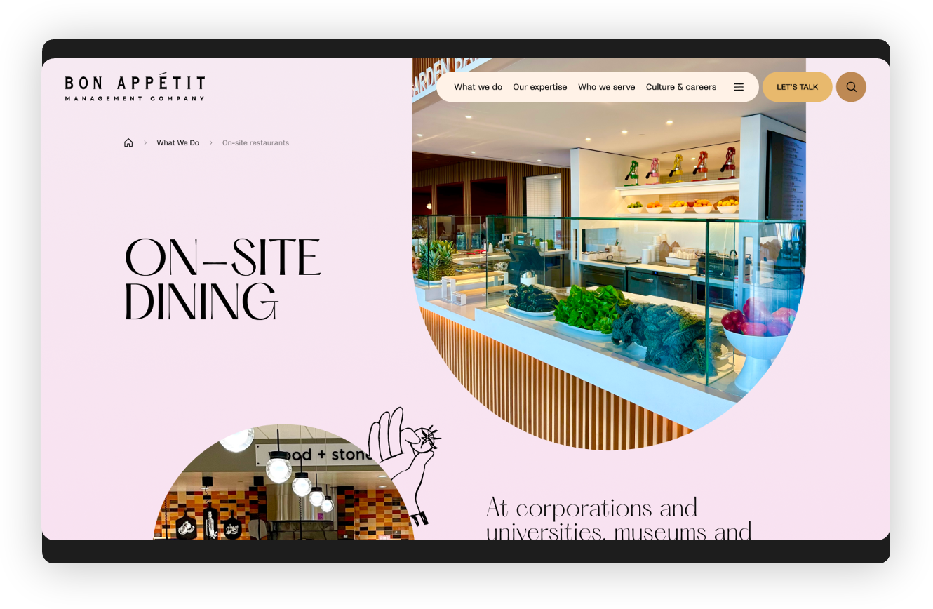
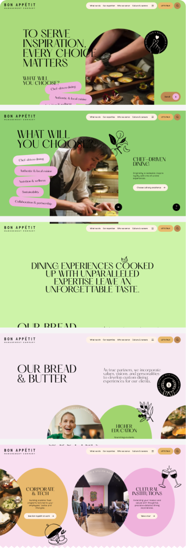
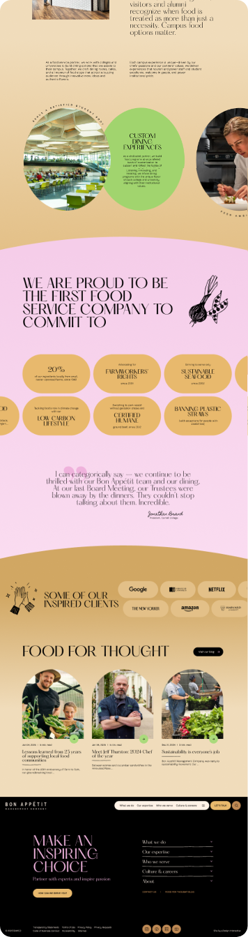
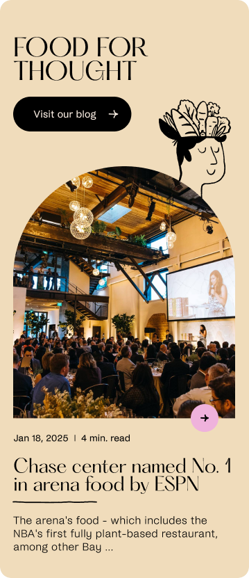
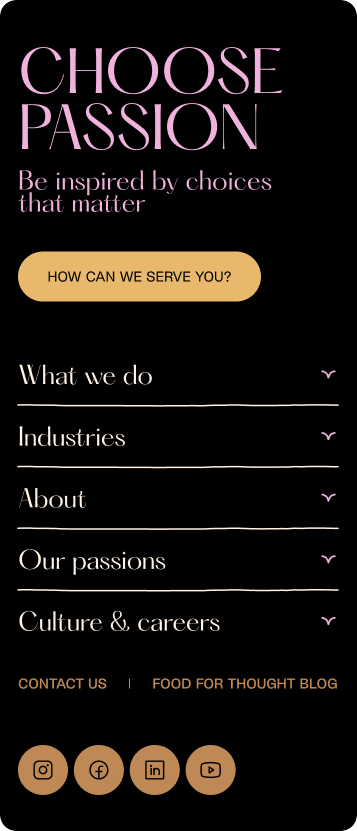
The new BAMCO.com is bold, story-driven, and built to differentiate. Vibrant colors, layered compositions, and editorial-quality imagery establish a visual language that’s warm, confident, and unmistakably Bon Appétit.
We rebuilt the information architecture from the ground up. Distinct user pathways were created for corporate clients, higher education partners, and job seekers, each with tailored messaging while maintaining a cohesive brand narrative.
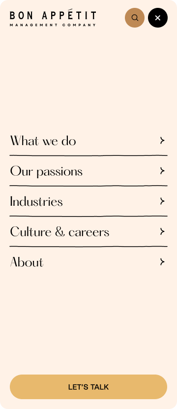
Navigation is intuitive, content is scannable, and calls to action guide users naturally toward conversion points.
Every page was developed to meet WCAG 2.2 Level A standards, ensuring accessibility for users with disabilities and positioning Bon Appétit for continued compliance as regulations evolve.
Accessibility was not treated as a checklist item; it was integrated into the foundation of the site.
Working with Bon Appétit was a masterclass in collaboration. They were thoughtful, communicative, and genuinely curious about our process. From the start, Bon Appétit treated our team as an extension of their own. They asked tough questions. They challenged assumptions. And when it came time to take creative risks, they trusted the expertise they hired.
We discussed concerns openly and arrived at better
solutions together. Nothing was sacrificed. Nothing was compromised. Bon Appétit gave us the space to do great work, and we gave them honest counsel and creative solutions at every turn. The result was a remarkably smooth launch, rare for a project of this complexity.
As Jenny Slafkosky, VP of Communications, shared at launch: “It’s bold. It’s brash. It’s like nothing in the industry. So it’s exactly what you’d expect from Bon Appétit.”
 You have helped us usher in a new era and we are so excited and grateful! People exclaim about how modern and beautiful the site looks. They love the colors and the style and are impressed by the design as a whole. Sending our gratitude and appreciation to you all!
— Bon Appétit Management Company
Beyond aesthetics, the launch marked an operational milestone.
For the first time in the company’s history, Google Analytics was implemented, establishing a baseline for measuring engagement, recruitment performance, and lead generation. While quantitative data is still being collected, the infrastructure for continuous optimization is now in place.
The launch is not the end of the story. We continue to support Bon Appétit through an ongoing maintenance partnership that includes technical support, functionality updates, and future third-party integrations.
For us at eDesign, this project represents what happens when strategy, storytelling, and authenticity converge.
Bon Appétit believes food deserves time, intention, and integrity.
We believe design does too.





More
projects
We use the power of digital technology to engage your audience...